Year
2023-2024
Scope of work
Web design
Branding
Brand strategy
Industry
Hospitality
Food
During one of the lectures at University, we were asked "what does a restaurant sell?". Many of my fellow students said - "food, obviously!", but I thought about it deeper, and realized that restaurants in fact sell - vibes, atmosphere. This realization opened my eyes and fascination with branding. I asked myself, why do people choose one restaurant over the other, if they sell the same food, for the same price? I applied this thinking to my university finals project, by creating a brand identity for a Canadian themed restaurant.
The challenge
Canadian cuisine isn't known in Poland, even the world's famous poutine is hardly heard of, so the challenge was to convince local audiences, to give it a try, and establish a new restaurant, that will be a great place for people to hangout.
Goals
Introduce Canadian food to a Polish audience
Create a warm, welcoming brand identity that celebrates food
Challenges
Relatively unknown cuisine in Poland
Large food market in the city
Chances
Unique dish among the competitors
Research
I wanted to find out traits that Polish people associate with Canada, what defines a "Canadian atmosphere" for them. Many Poles view Canada as a welcoming, peaceful, and multicultural country. The common stereotypes mentioned in an online survey include politeness, friendliness and vast natural beauty. Canadian icons like maple syrup, hockey, and wildlife were also often mentioned.
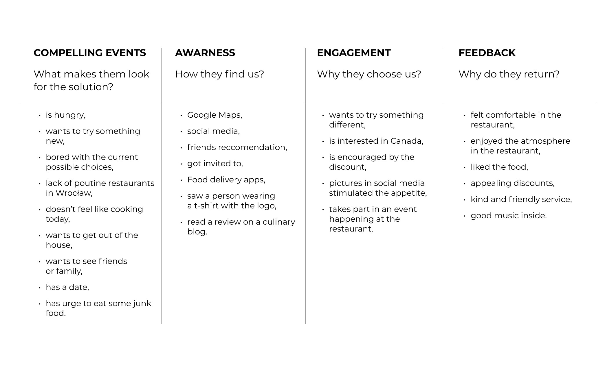
Desk research was also done to see potential local competition. Due to lack of Canadian-themed restaurants in Wrocław as well as all of Poland, I had to find out what makes the most popular local restaurants - so popular. It turns out that the lifestyle aspect is the most common among them, heavy social media presence and promoting the social aspect of dining, rather than just the food itself.
Brand values
The established core brand value revolves around creating a sense of community and friendliness that Canada is known for. The restaurant seeks to embody the laid-back, easy-going lifestyle that many associate with Canadian culture. It's a place where customers feel like they’re stepping into a cozy, warm space full of smiles, hearty meals, and polite service.
FRIENDLINESS | OPENNES | KINDNESS | EASY GOING
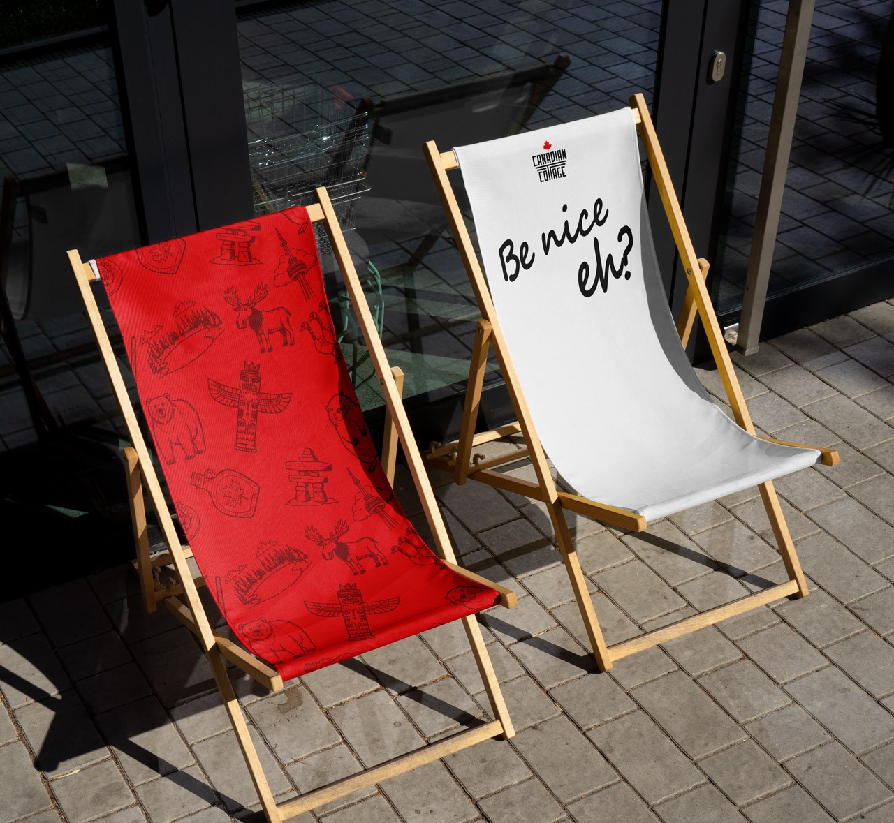
The Big Idea of the Canadian Cottage is a message defining all of the core values. It's not just a note to the customers, but also a key driving factor for the restaurant itself. By including a casual Canadian "eh", it further enhances the Canadian spirit of the place. Below is a 3D rendering of a neon sign that would be placed on the wall of the restaurant, to remind both customers and workers, about the core principle of the organisation.
Visual branding
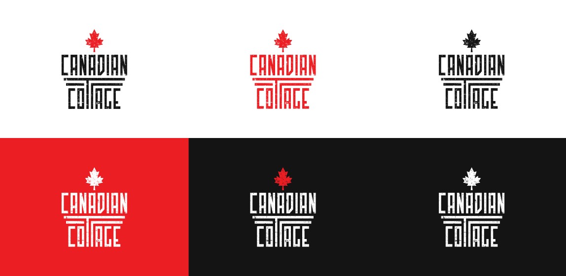
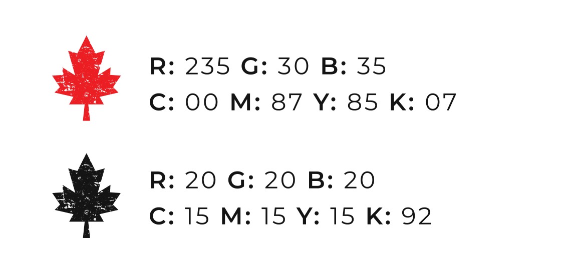
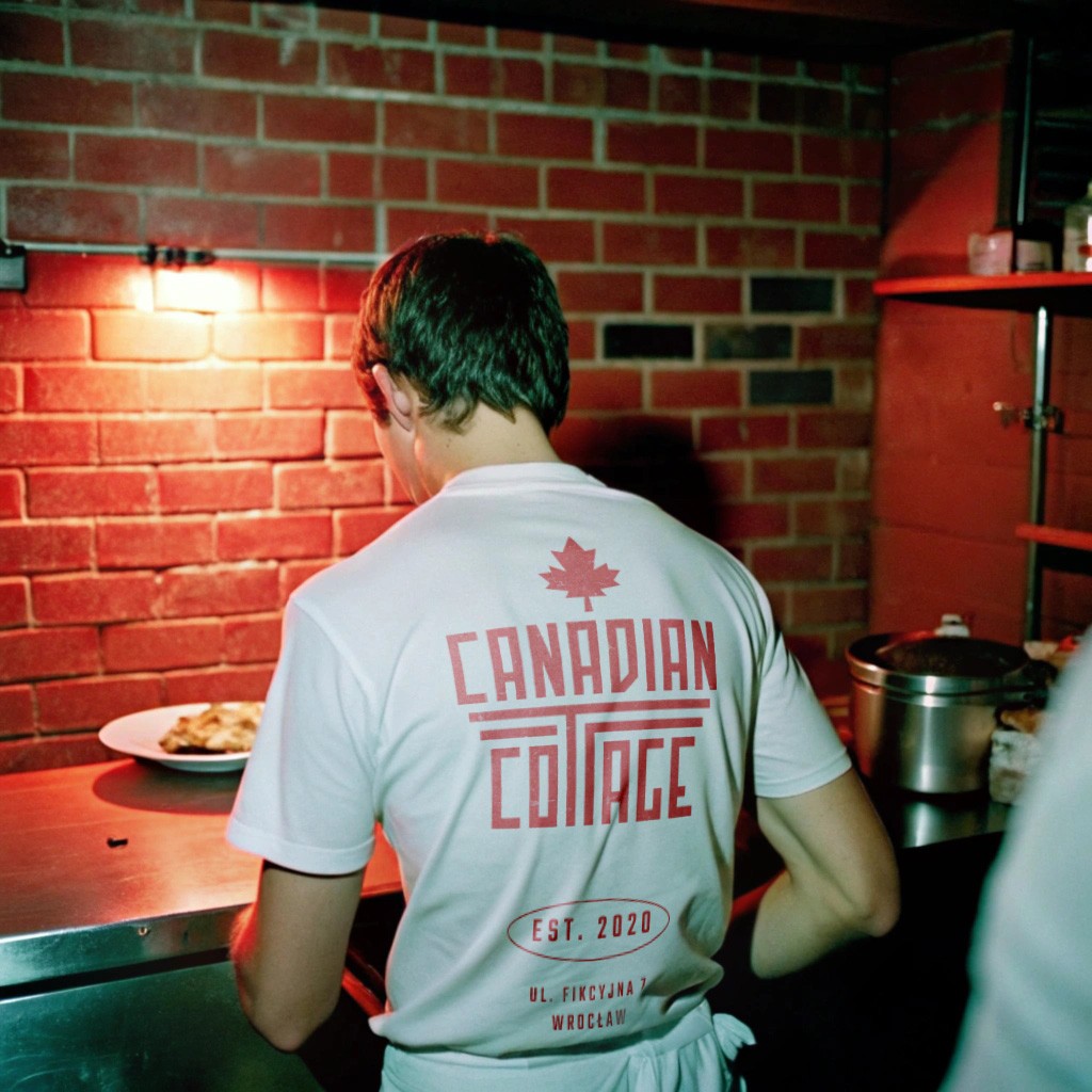
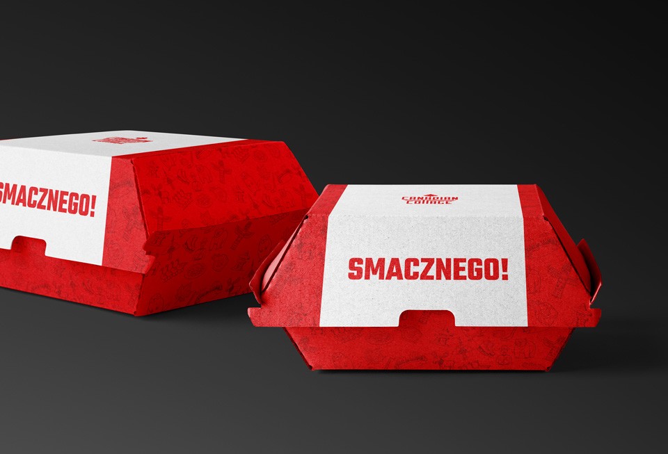
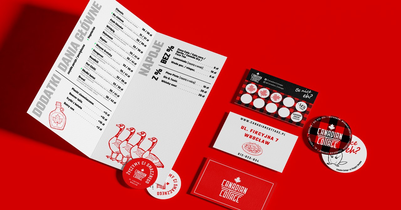
The visual identity for Canadian Cottage revolves around a bold, striking color palette dominated by red and black, colors that are both iconic to Canada's national identity (think of the red maple leaf) and that resonate with the strength and warmth of the brand. These colors also carry a modern, sleek appeal that feels fresh within the restaurant scene.
Iconography and illustrations would include Canadian symbols such as maple leaves, moose, and hockey sticks but styled in a modern, minimalist way, avoiding overly rustic or cliché designs. This balance maintains cultural relevance while appealing to modern Polish sensibilities.
Website
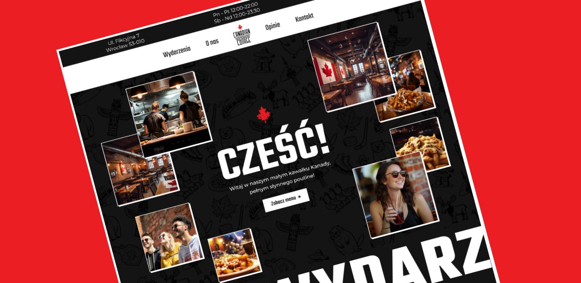
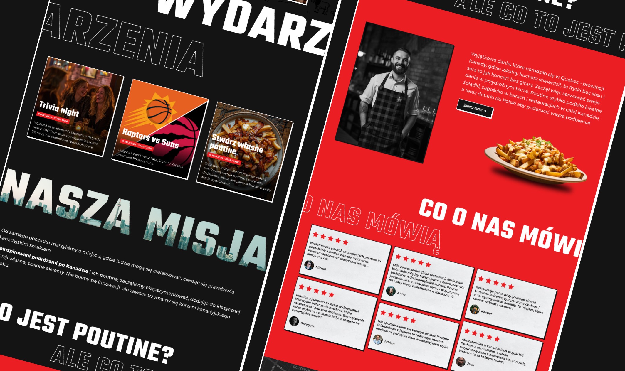
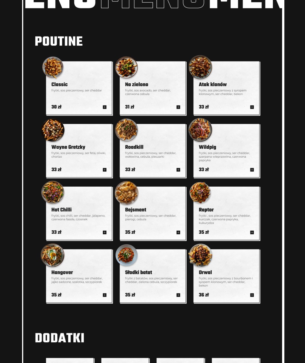
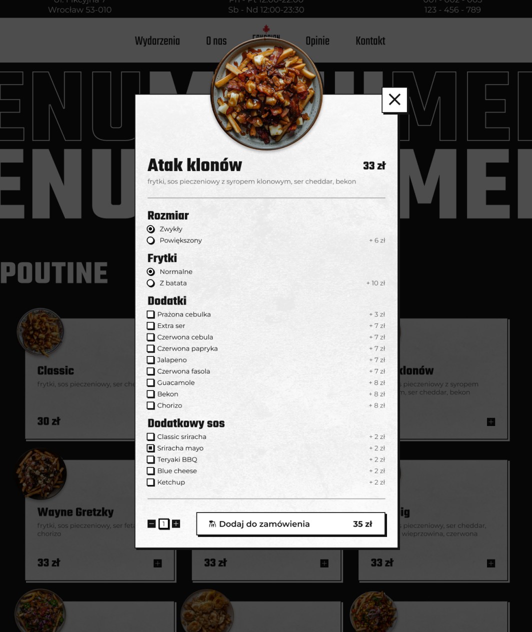
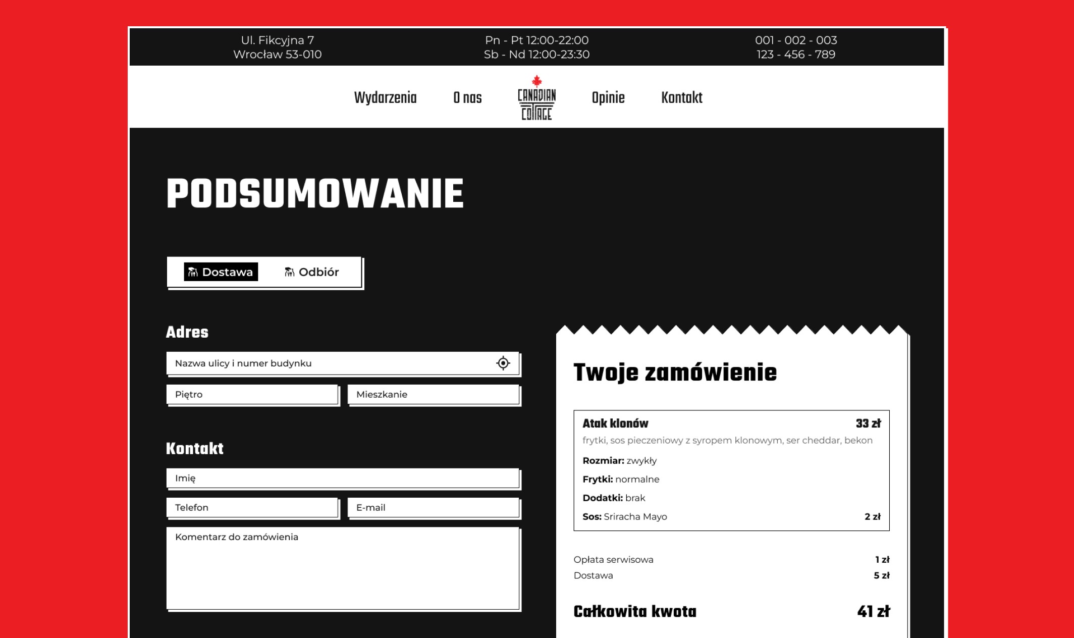
The website is not just an information hub; it’s a key part of building the overall Canadian-themed atmosphere. The design should carry forward the bold, clean look of the visual identity with a strong red and black color scheme and large, inviting imagery of both the food and the Canadian wilderness.
